
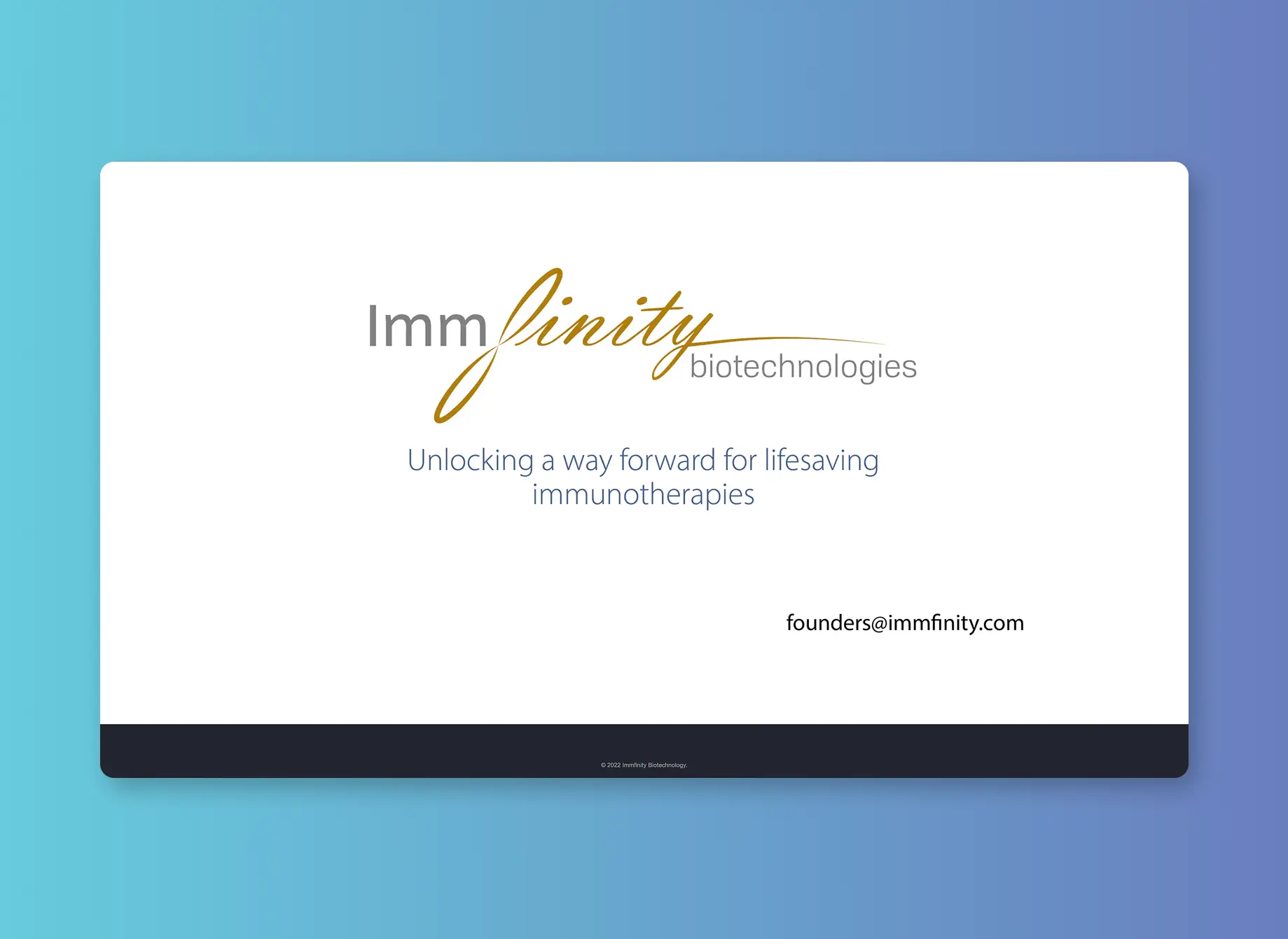
Summary
Creating a brand identity from scratch that reflected the conservative values of the medical industry with the expressiveness of forward-thinking start-ups.

Context
Immfinity Biotechnologies is a Vancouver-based company specializing in therapeutic T-cell receptors to advance immunotherapies. Their work aims to accelerate the development of lifesaving treatments by enhancing immune system responses.
Rationale
This case study serves as an answer for how modern design fits into the traditional medical industry. As a first-year design project, my mission was to develop a brand identity for an emerging local company. I chose Immfinity Biotechnologies because their current identity served as a blank slate. What do I mean by that? You'll see…
Problem Discovery
If you searched up Immfinity Biotechnologies on Google, you wouldn't see much. Such a lack of online presence meant my work was cut out.
Diving Deeper
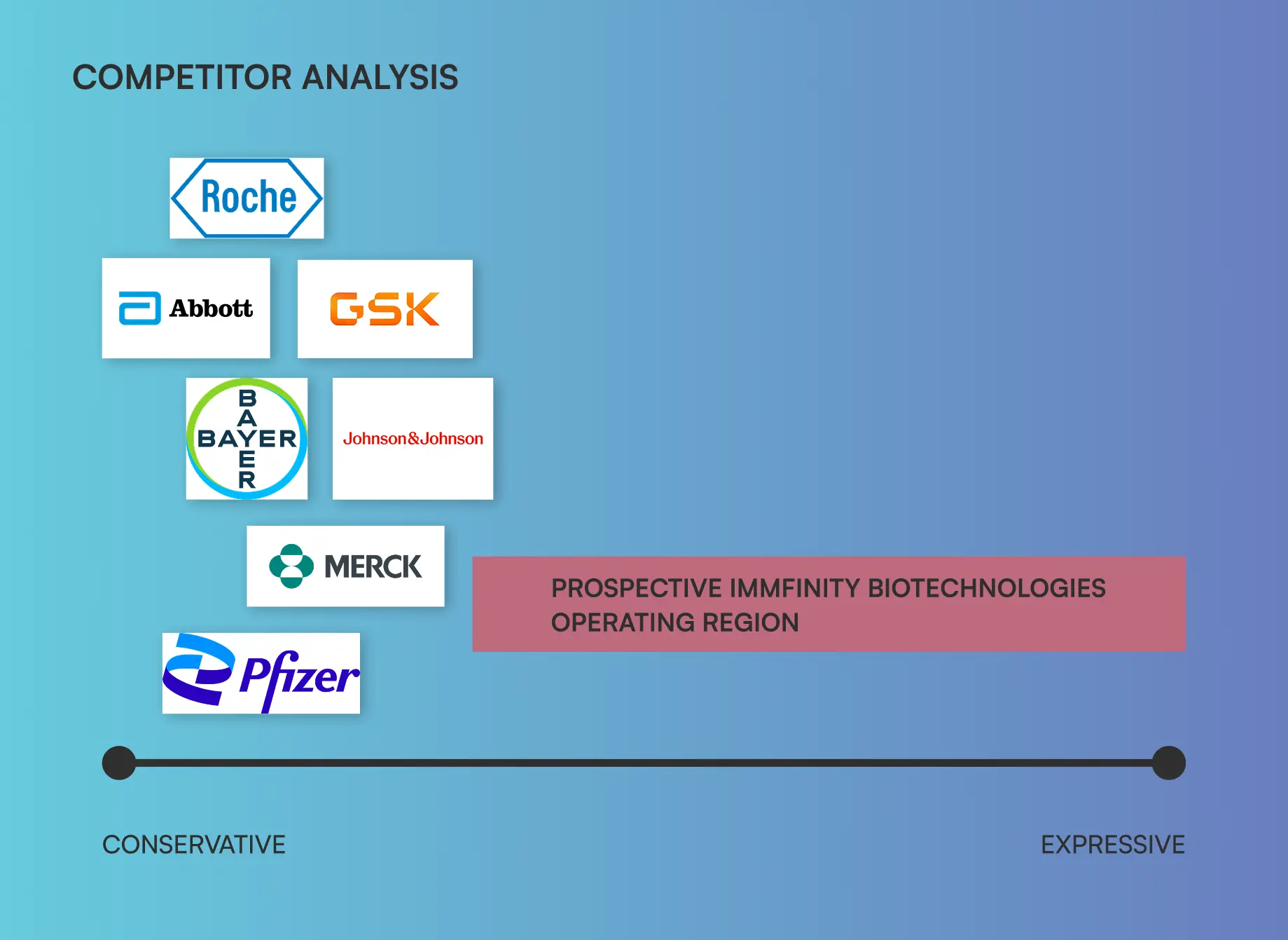
For a start-up competing with juggernauts in such a conservative field, one way to stand out is by breaking the mold. After conducting competitor research, one common theme was the lack of expressive design.
HMW Statement
How might we create an expressive design that echos the professionalism and safety offered by fully functional designs in the medical industry?
Solution Ideation
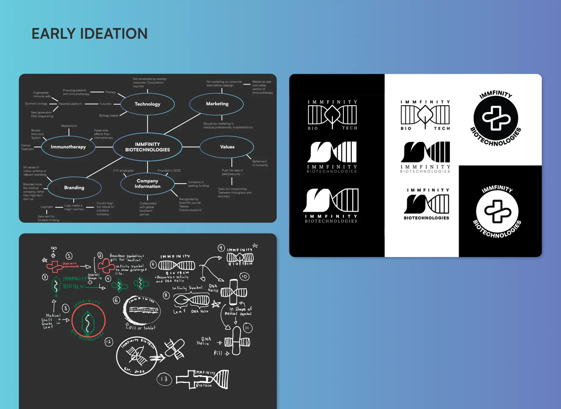
There was a fine line between creating something too expressive and too conventional. Good design often begins with a lot of image grouping, so that's where I began.
Validation
So, how did I realize my idea worked? Well, I looked at parallel industries. Pharmaceutical giants might not be demonstrating the cross roads of conventional and expressive, but medical start-ups looking to create an impact are.

Ideation
Finally, I begin designing. In the context of the modern world, the logo had to be transferable across various mediums, including print, digital still, and digital motion. Furthermore, two facets of immunotherapy—longevity (of life and treatment) and safety had to be conveyed.
Solution
Hundreds of iterations later, and I created a fluid identity with considerations in print installation, social media branding, and a website.

Design Decision
Principle #1
Fluid shapes to convey motion
Principle #2
Cool palette reflects sterility and safety
Impact
Immfinity Biotechnologies went from having a landing page, to a fleet of assets including a transferable logo, media assets, and a microsite.
Reflection
This first-year assignment was my formal introduction to Figma prototyping and logo redesign. I was able to extrapolate design principles, create meaningful assets, and develop UXD guidelines. However, looking back, a deeper understanding of competitor analysis and market research could make a much stronger identity.
