Context
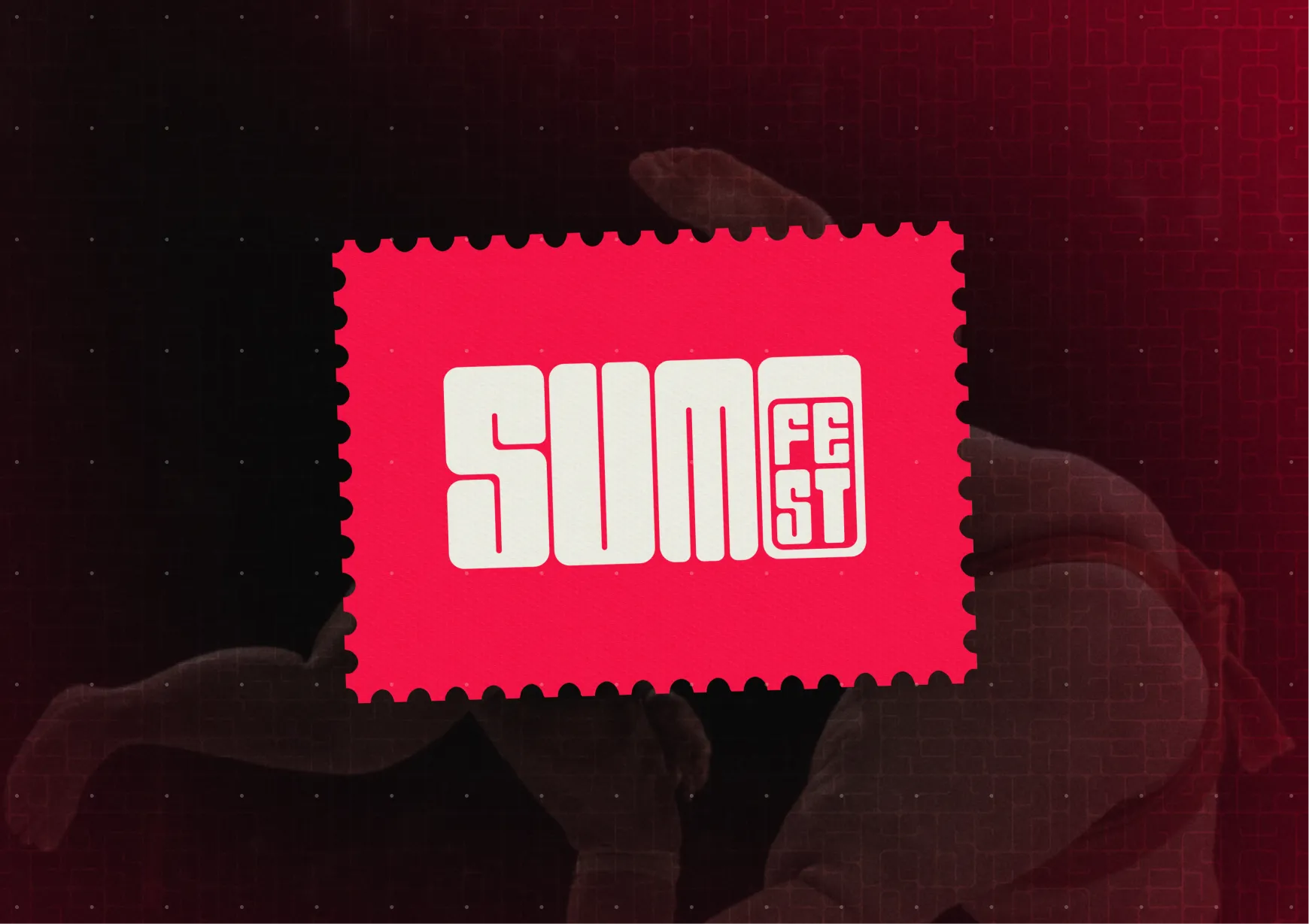
SUMO Fest is the first sumo wrestling festival Canada has ever held, exclusively ran with Showpass in partnership with the Calgary Japanese Community Association.
My Role
I was in charge of leading branding efforts through the: logo, type, colour, wayfinding, print, and the website.
The Problem
Building the face of a culture that isn't mine, with no one on the team who could tell me when I got it wrong was the crux. Lean on the obvious version of Japan, red circles, cherry blossoms, rising suns, and you don't just make a generic poster. You misrepresent the community the event exists to celebrate.
The whole project came down to one question:
How do you reference a culture with respect instead of performing a costume of it?
Research
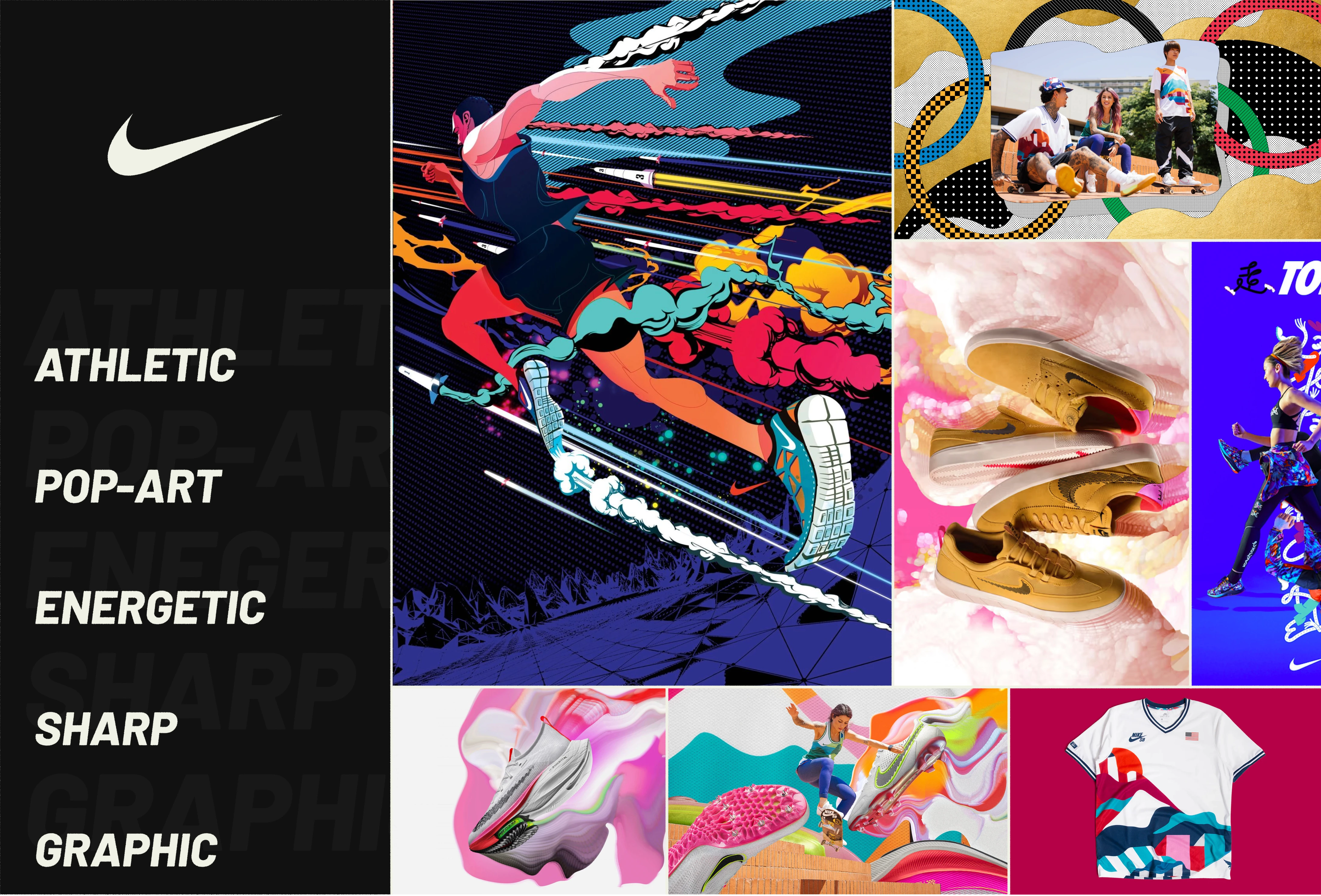
With no cultural collaborator, I built my own reference system. I split Japan into two moods, Tokyo and Kyoto, to force specificity, then studied how brands like Nike and Uniqlo reference the culture without imitating it.

TOKYO
High flash
|
candid
|
CHAOS
|
ENERGETIC
|
URBAN
KYOTO
MELLOW
|
CURATED
|
SERENE
|
NATURAL
|
LUXURIOUS
NIKE
BOLD · ATHLETIC · ENERGETIC · GRAPHIC
UNIQLO
CROSS-CULTURAL · SCANDI-DESIGN · RESTRAINED · PRECISE

Logo
The logo had to feel like sumo without illustrating it. Planted, compressed, immovable, but round enough to still feel inviting. I went through 55 variations to get there.
logo — 55 variations contact sheet
SERIF / ITALIC
READ TOO EDITORIAL, WRONG ENERGY
DIAGONAL SLASH
GENERIC SPORTS BRANDING, COULD BE ANY LEAGUE
CHRYSANTHEMUM MARK
TOO OBVIOUSLY “JAPAN,” REFERENCE TIPPING INTO CLICHÉ
DIRECT KANJI
DECORATION I HADN’T EARNED, MEANING AS ORNAMENT
The O became the letter I spent the most time on. In the final lockup it’s a red oval seated inside the word, a figure planted in the ring.
logo — final lockup, red O in the ring
Compressing the type that tightly created a problem. Squeeze the letterforms and SUMO starts reading as SUM. I caught it, stakeholders flagged it too, and the final spacing plus the weight of that red O exist to close the gap. Immovable was the goal, but legible came first.
logo — legibility fix, SUM vs SUMO before/after
Typeface
No free font did both jobs, so I drew one. Round and inviting up close, compressed and immovable at scale, like a wrestler holding a stance.

Colour
Three colours, each earning its place. Oni red for energy and alertness, jet black for weight and contrast, cream to keep the palette warm instead of aggressive. A fourth, a purple I called Ceremony, kept stealing attention from the red, so I cut it.
RED
STAYS ENERGETIC & CULTURALLY GROUNDED
BLACK
ADDS WEIGHT & CONTRAST, A CLEAN NEUTRAL
CREAM
SOFTENS THE SYSTEM, ADDS WARMTH
colour — palette applied across the system
In the Wild
The system had to hold from a phone screen to a highway banner without losing itself.
poster series
highway banner
wayfinding & signage
event accreditation
sold-out venue, 2,600 seats
Outcome
Sold out. 2,600 seats and 30+ sponsor partnerships. With no time or budget for motion or illustration, the brand had to find its energy in type weight, colour, and compositional tension alone, and it ended up feeling more alive for the constraint.
Acknowledgements
Zariyan resides on the traditional and unceded territory of the xʷməθkʷəy̓əm, Sḵwx̱wú7mesh Úxwumixw, səl̓ilw̓ətaʔɬ, QayQayt First Nation, Kwantlen, q̓íc̓əy̓, Semiahmoo, Tsawwassen First Nations, kʷikʷəƛ̓əm, and Stó:lō Nation.
© 2026 Zariyan Mansoor