Role
Visual Designer
Assistant UX Designer
Summary
A time-sensitive microsite that promotes the youth of a beloved design festival. Rooted in the study of fundamental UXR and Graphic Design principles.
Context
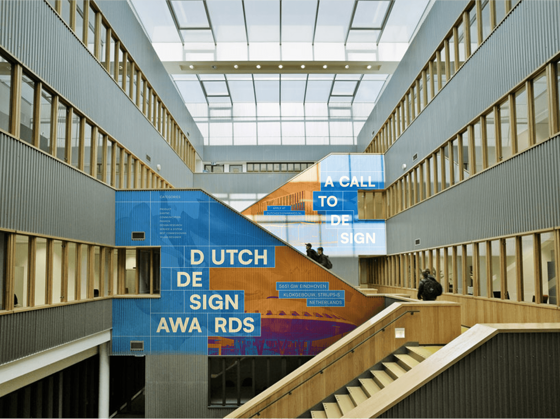
Dutch Design Awards (DDA) is an event that celebrates excellence in design across various categories. The ceremony awards designers based on several categories, such as Product, Fashion, and Habitat.
The Problem
My Role
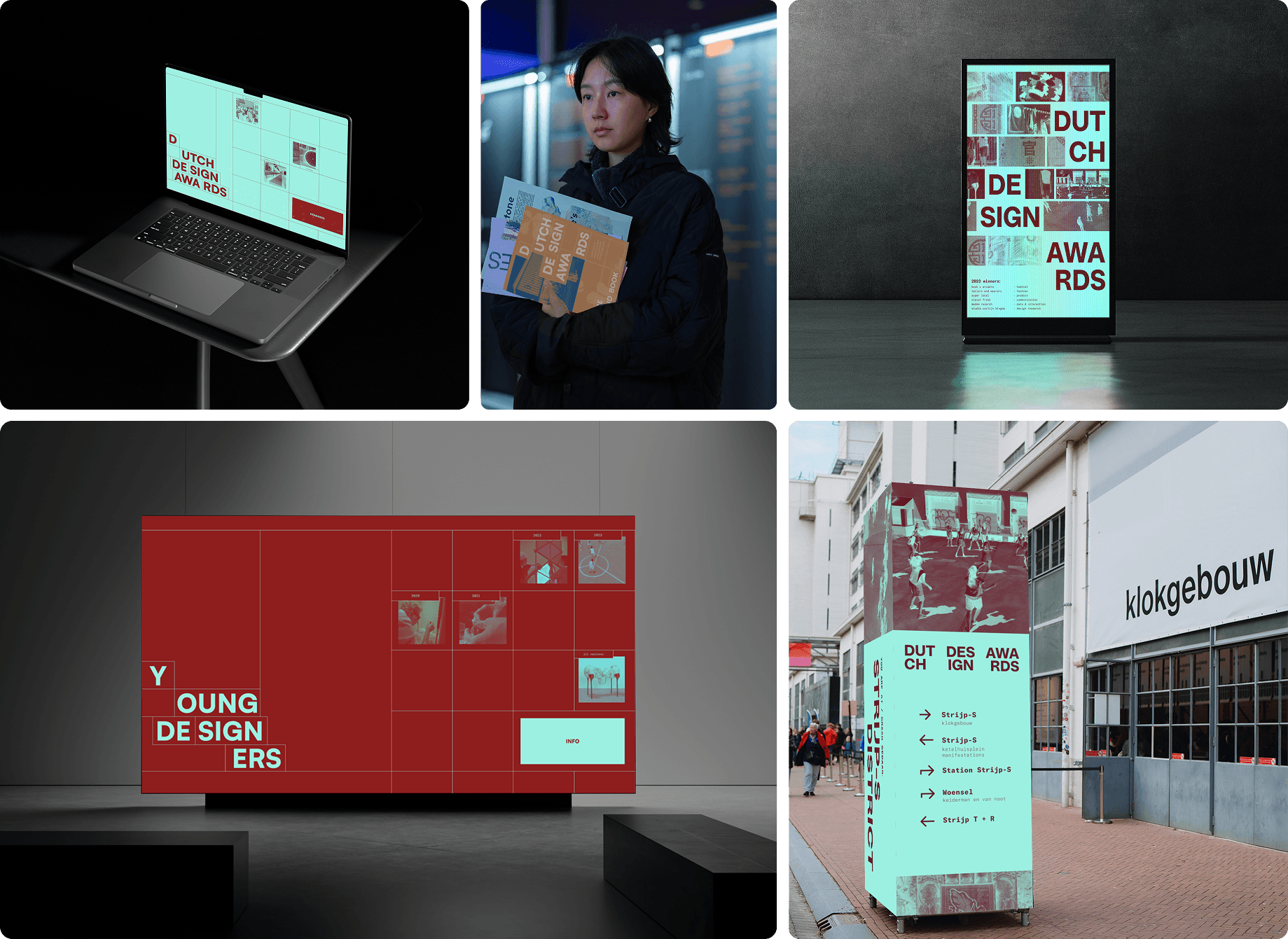
I was in charge of leading the design direction by creating an cross-medium identity. Additionally, I led a time-sensitive UXR campaign and laid the fundamental foundations of our Figma prototype.
Preliminerary Research
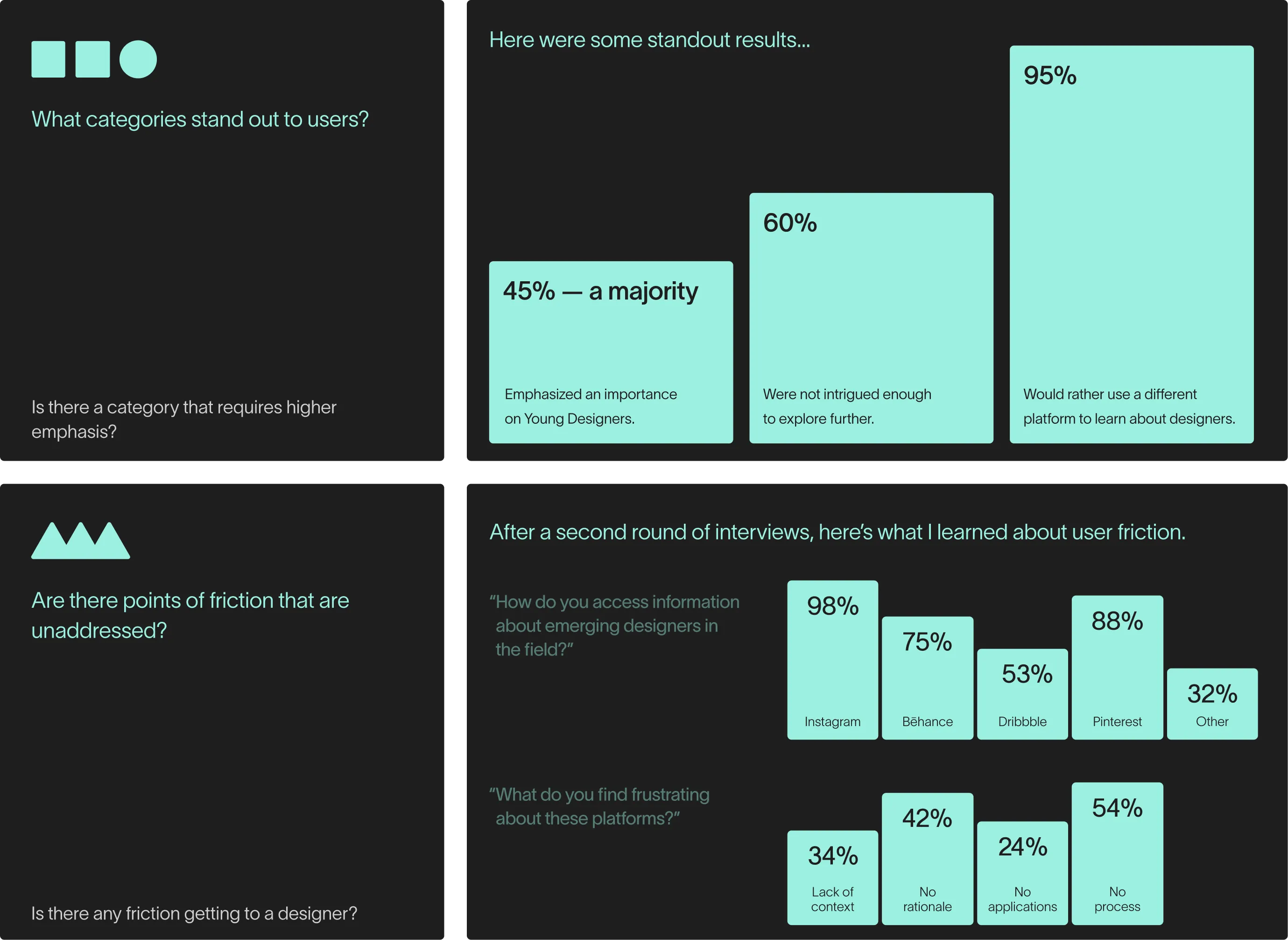
I launched a 2-day UXR campaign to gauge pain points on the DDA website. The outreach was done in-person, Instagram, and on Discord and resulted in 12 in-person interviews and 8 online surveys.
The Goal
Problem Discovery
Although a category existed for Young Designers on the DDA website, it was severely underrepresented and difficult to discover.
HMW Statement
How might we create a bespoke platform for Young Designers at the DDA that reduces friction between users and engages connection?
Information Gathering
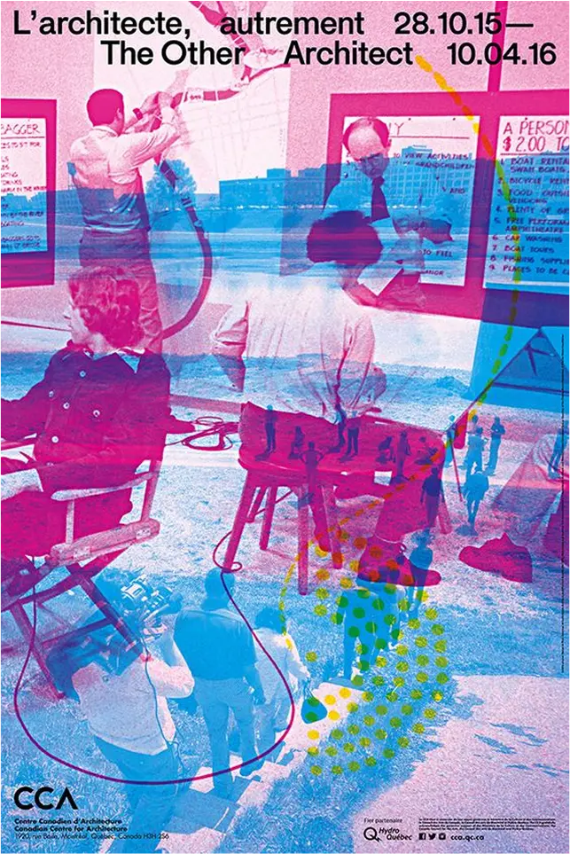
I began with looking at the works of Bruce Mau and Ellen Lupton for our design identity. From there, I extrapolated design principles that could be referenced in my work.
01.
Merging elements through transparent layers
Layering a transparent image on top of an opaque one merges them while keeping parts of the image visible so elements can be differentiated. This effect can create a new composition or bring attention to selected elements in both images.
02.
Patterns create familarity and emphasis
03.
Image cropping to create new figure ground
04.
Visible grids to organize elements
05.
Image is placed around type
What I Had to Fix
Reduce time-to-confidence
Increase spatial clarity & context
Allow safe experimentation without penalty
Solution
Design Refinements
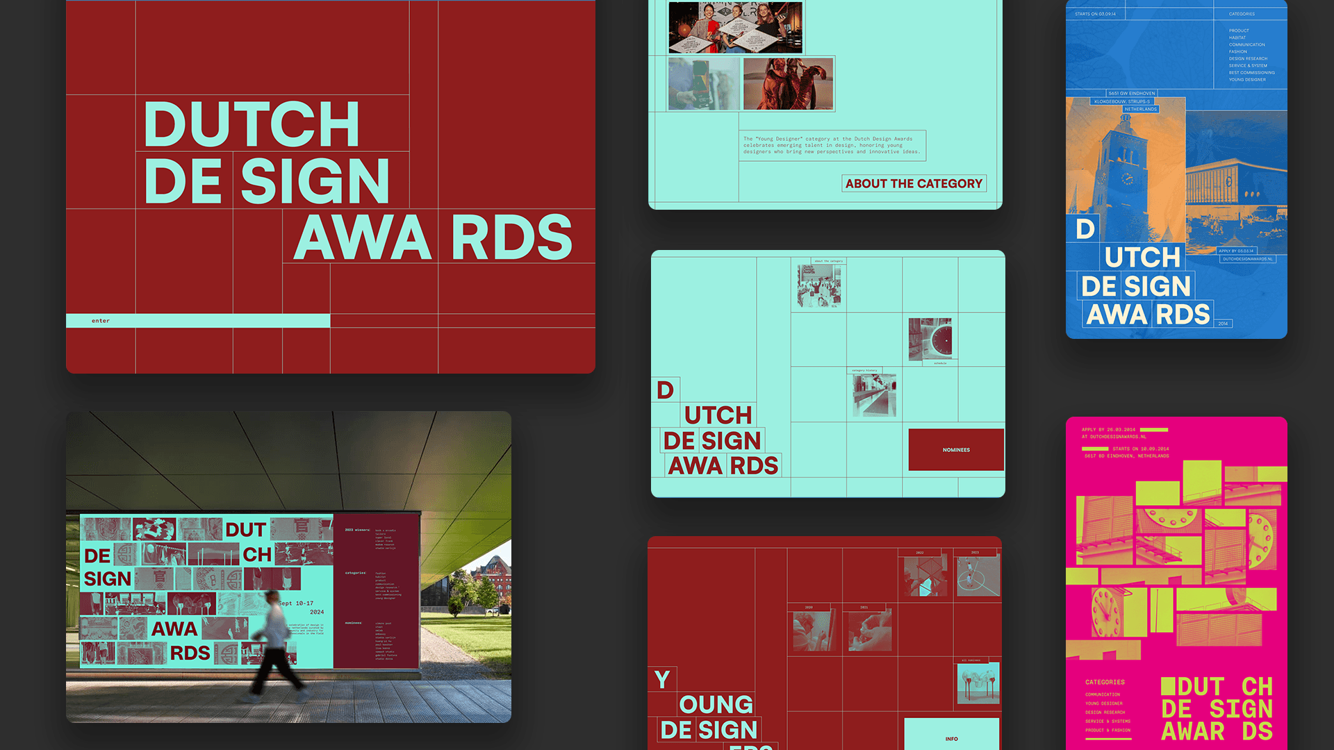
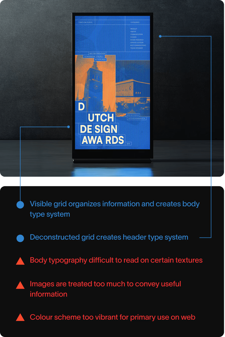
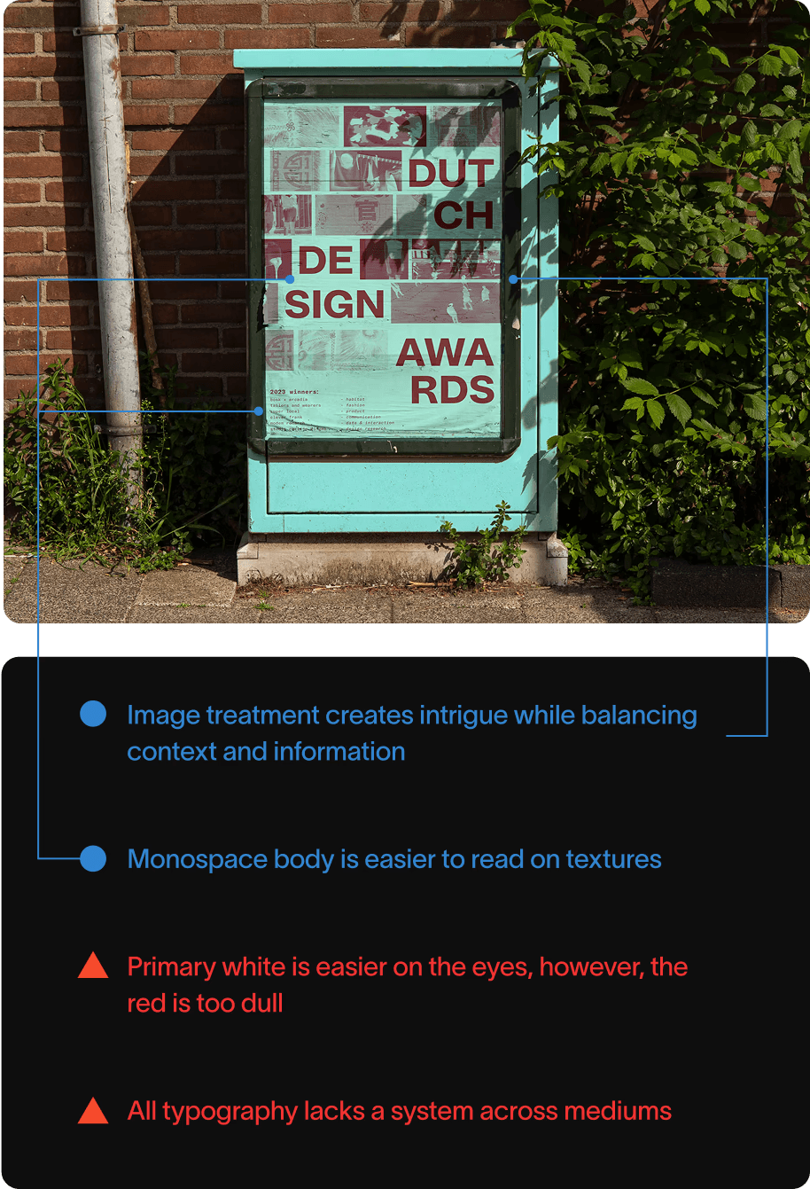
After all that intense work… these 2 posters had the most potential. In the end, I consolidated them into our final direction.
Addressing Pain Point 1
Finally… Time to design on web. To address our first problem, I laid out the foundations of our microsite by developing a Design System. The principles were derived from design-adjacent websites on Framer and Webflow Gallery.
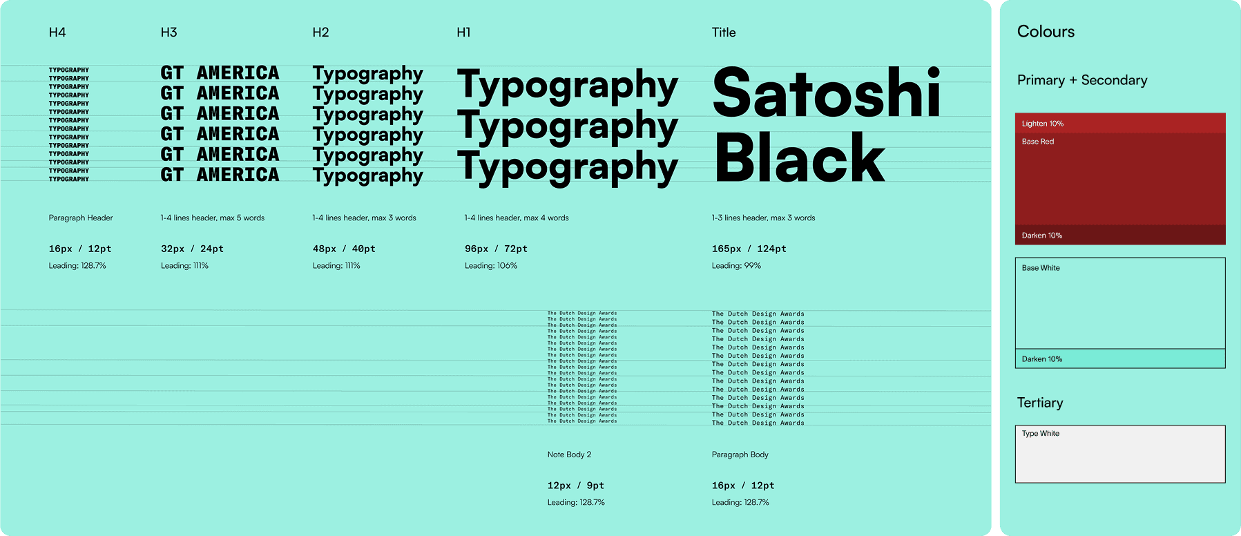
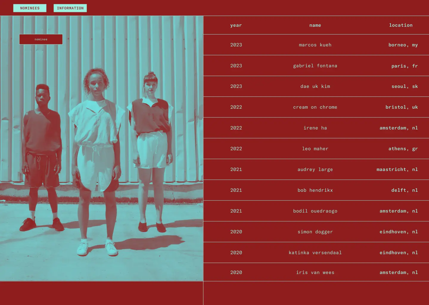
Image appears on hover of relevant text
When brought to the ‘all nominees’ page, users can direct themselves to designers by hovering over the their row. The image appearing on the left gives a preview of the designers’ work and appearance.
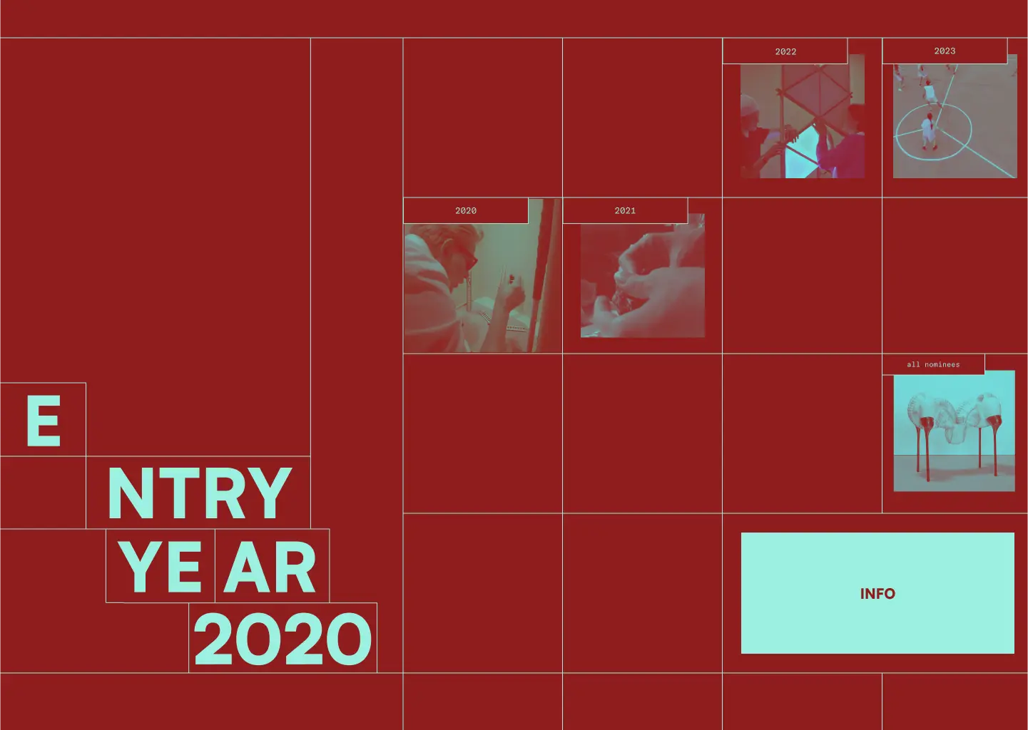
Hover to enlarge content
Before a user clicks on a year, they are presented a video clip of a project from each nominee of that year. Paired with the enlarged size during the hover, a call-to-action button is made.
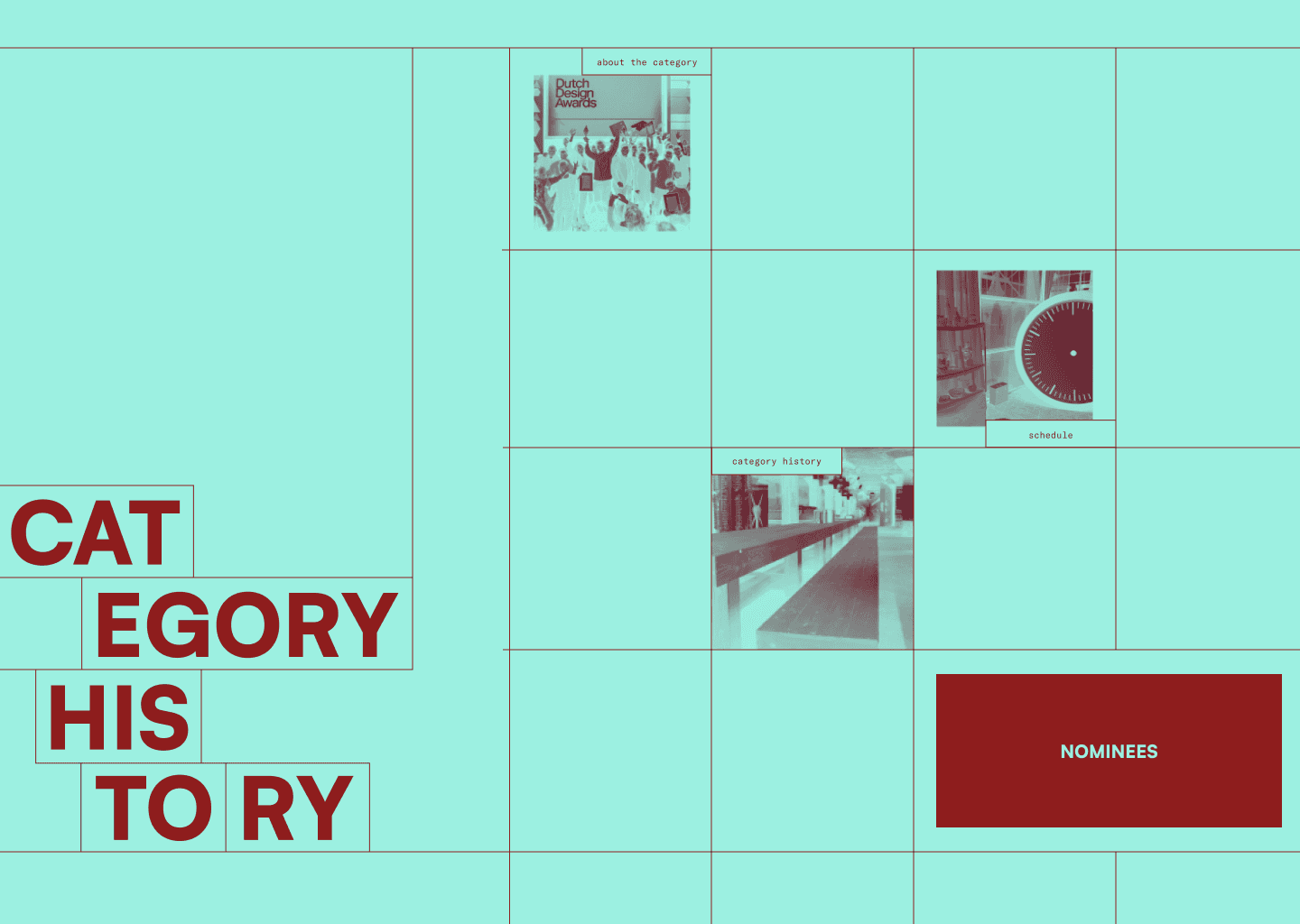
Click to switch to another subpage
Users are able to navigate easily back and forth between the Young Designers and Information about the category and Dutch Design Awards.
Addressing Pain Point 2
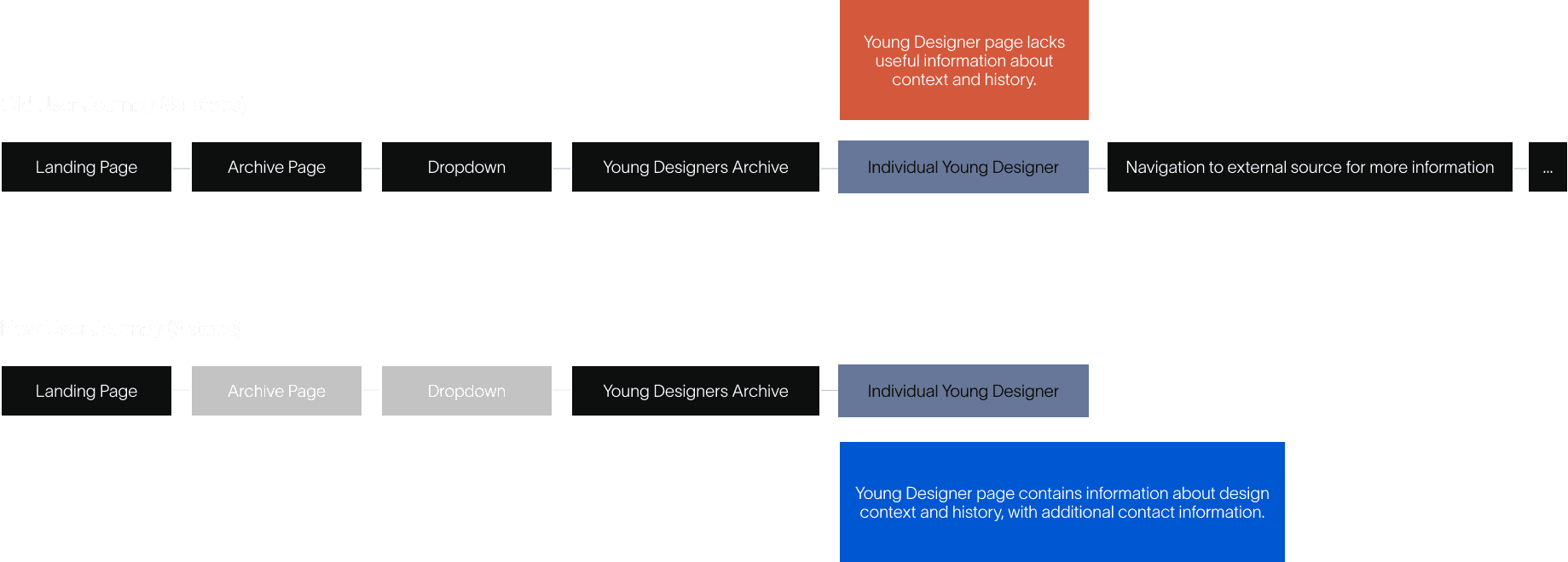
The original user journey was long and tiresome. I consolidated it by reducing the number of steps from 6+ to 3.
Outcome And Reflection
Addressing Pain Point 3
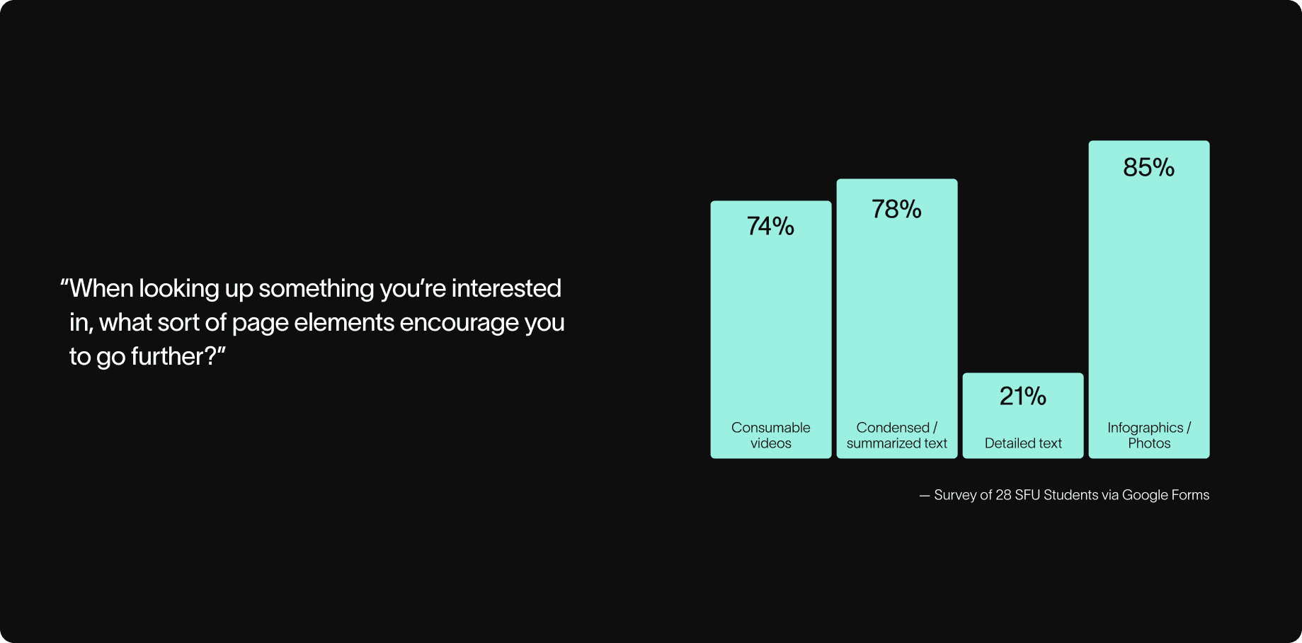
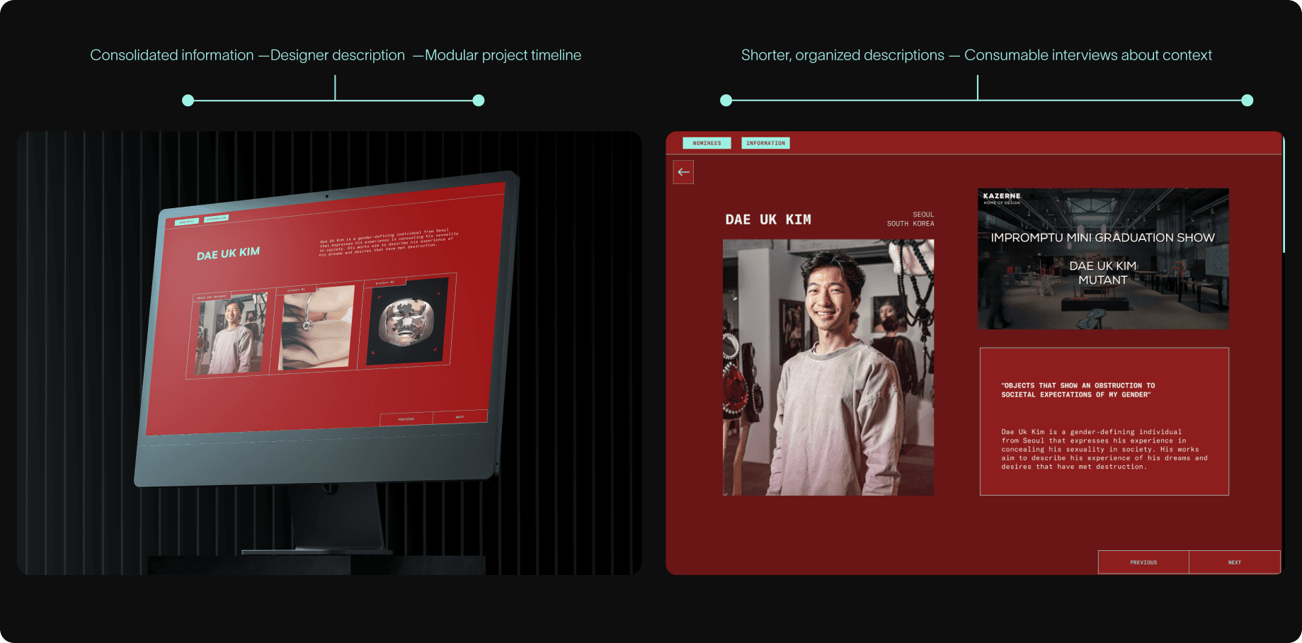
After conducting more UX research, I found an aversion to large amounts of text. To mitigate this, I used a variety of different methods to convey information.
Solution
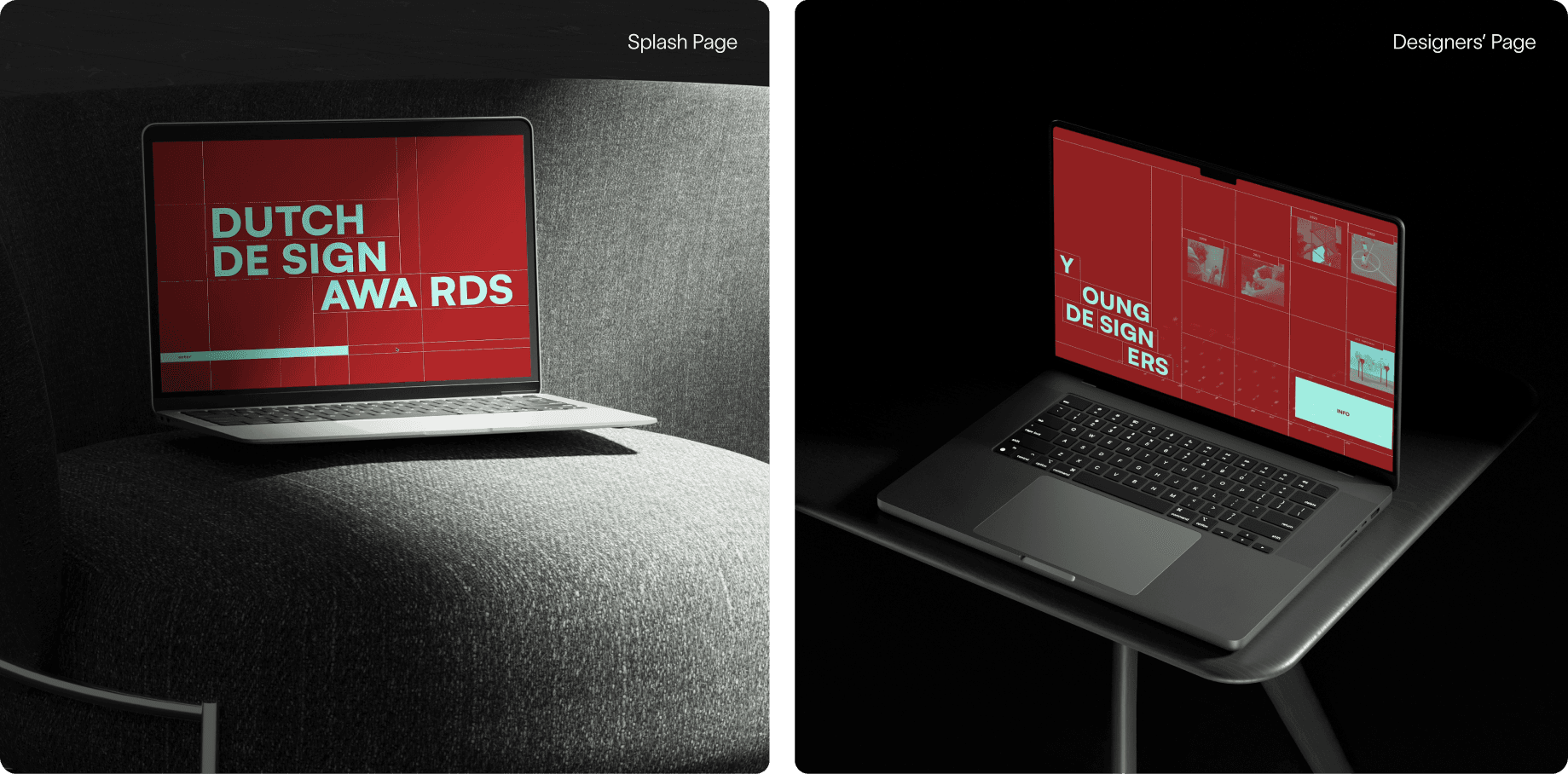
And here it is. A Figma prototype that shows the realization of our concept from 3 weeks ago. After an intense week, this is what we were able to come up with.
Reflection
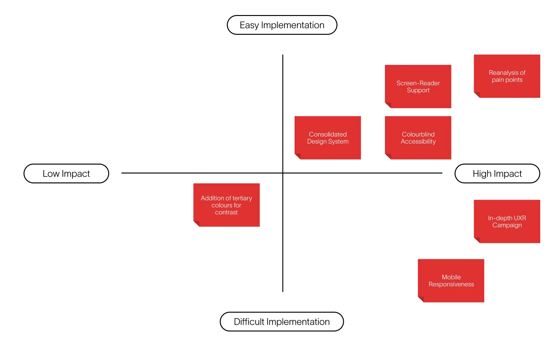
Rapid iterating and asking, asking, asking questions were major skills I learned in this 3 week endeavour. However, it wasn't perfect. Looking back, I would like to place a larger emphasis on accessibility features, such as a screen-reader. Additionally, optimization for mobile would be a big consideration.